Sunday, March 13, 2011
Ronnie Van Hout
the use of the object against the photo of the landscape gives off the impression that the object of the eye is actually placed in a landscape of hills and sand. i like how that eye has been focused on so the background is blurred, also how the colours used in the background are different to the object so it makes it stand out more.
Thursday, March 10, 2011
slinkachu
i really enjoy Slinkachu's work in the way he uses small objects and puts them against ordinary/ life size scenes. i really enjoy how in the first one there is a small toy man holding a actual size daisy with a large rock in the back ground. in the second one i like how the deer have been placed next to some cigarette buts and one of them has been placed to look like it is smelling on of the cigarette buts. the lighting used seems to be natural lighting from the sun as it seems these pictures were taken outside. the use of toys and real life i think is very creative.
i have used inspiration from Slinkachu's idea of taking an object and placing it in a ordinary place (human size) and making a scene. i have placed a metal sail boat in a puddle that was on my driveway and created my own scene.
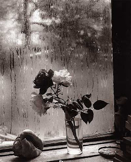
joesf sudek
this image seems to be quite busy with lots of small objects, but the light coming through the window highlights the roses in the middle making them contrast well against the window with rain trailing down the glass. the emotion in this image is easily shown in the use of colours and the window in the background shows a gloomy, rainy day that matches the emotion well.
Laurence Aberhart
the use of the black and white effect helps set the emotion in this image. the lowish angle helps make the cross become larger and have darker shadowing. the darker the cross becomes the more it contrasts against the lighter cloudy background. i like how just by looking at this image it portrays a strong feeling of sad emotion.
Wednesday, March 9, 2011
Uta Barth
i like how the photographer Uta Barth has changed the focus on her camera lens to make the image become blurry. the colours are still strongly showed in the images which can sort of give us an idea of what the scene may be portraying. i like the effect that this picture has and how looking at this picture, is the same as looking through a stained glass window.
i really like the use of focus in this picture and how the image has been cropped into four different sections but on closer inspection we can see that if re-arranged its a whole flower if you join it back up but just taken from different angles. the use of the effect to make the background become more dull helps the flower become the dominant focus.
Jorg Sasse
in this picture by Jorg Sasse we can see that the artist has used different textures throughout the picture to support the subject matter. the use of lighting seems to be normal lighting with no natural lights. the shot being taken on a front view causes their to be no obvious shadowing surrounding the object placed in the center of the image.
in these pictures i took the idea of the different textures from Jorg Sasse. the 1st one shows tiles wood and just a painted wall and the 2nd shows, wood, painted wall and shiny metal (fridge)

marti friedlander

this Marti Friedlander picture here shows a scene of two subjects standing in a kitchen facing a window. the light coming through the window seems to highlight the subjects face which contrast well against the darker background. the lighting in this photo also gives us a clear idea of what the emotion of this picture could be
.
Monday, March 7, 2011
Tuesday, February 22, 2011
Muybridge
in this picture i like the way that a fast
shutter speed has been used to show the
journey that the horse is taking. the fast
shutter speed captures the light quickly
so we can capture each movement and
watch it in a sequence.
shutter speed has been used to show the
journey that the horse is taking. the fast
shutter speed captures the light quickly
so we can capture each movement and
watch it in a sequence.
Julia Margaret Cameron
Julia Margaret Cameron's seems to be manly
portraits from the shoulders up or family like
photos. Cameron's photos date back to
the 1800s, which explains the renaissance effect to the pictures.
i really like how this picture was taken with a pinhole camera, which
means that the light was trapped in a box with a small hole at the front
to capture the image that was in front of the box to create a photo.
also i like how the lighting in this picture highlights the face and makes
it stand out more against the darker background
Sunday, February 20, 2011
Ralph Gibson
in this image i like the way that the subjects expression is cropped out of the image so we are left wondering, but then the colours used reflect what could potentially be its emotion by the use of black and white. i like the way that the background is solid black and the subjects face stands out and given a white complexion.
Subscribe to:
Comments (Atom)


